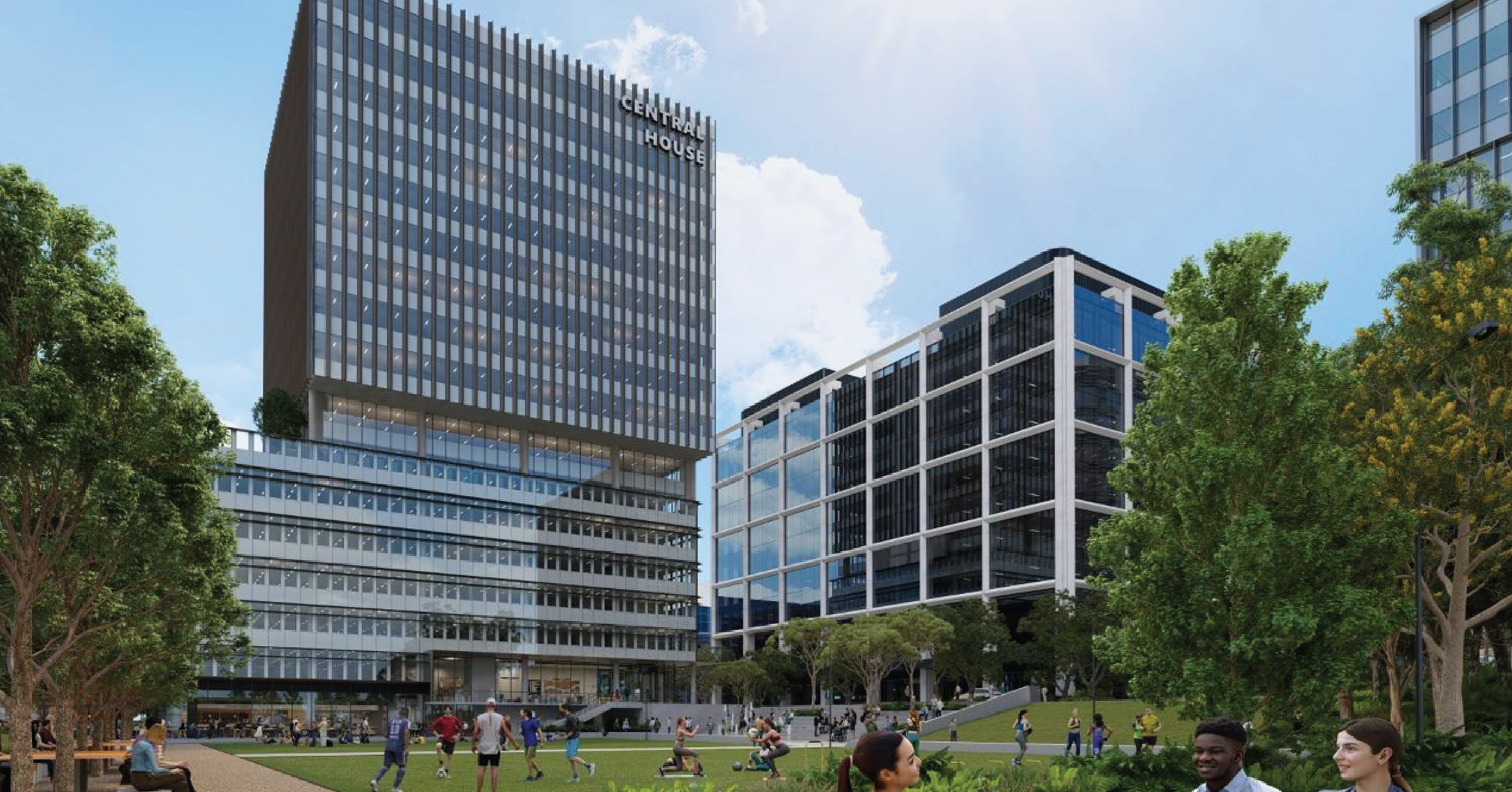
Rising 14 storeys above Catherine Hamlin Park, it will be the tallest building at Macquarie Square. Recently, we caught up with Rodd Perey, Principal and Group Design Technology Manager at Architectus to discuss the inspired and lofty ambitions for Central House.

Thank you for speaking with us, Rodd. What role has Architectus been playing at Macquarie Square, and Central House in particular?
Rodd: Initially we were engaged by John Holland in the delivery stages of the first building to be completed at Macquarie Square, the Glasshouse. It was a highly innovative project to be part of and we had a very good experience. It all went quite smoothly, and the result was a fantastically good building, a very exciting space to be in. We also had some prior involvement with the initial master planning exercises for Macquarie Square, so the precinct certainly wasn't unknown to us when we began working on Central House.
How does Central House fit within the wider masterplan at Macquarie Square?
Rodd: The Glasshouse is an amazing building. But when it was completed, it was clear what was still needed within Macquarie Square was that hub with amenities, social spaces, and a really interesting mix of facilities – because modern commercial precincts simply can’t survive on office buildings alone. That’s where Central House comes into its own. Of the four main buildings, it’s the one with the strongest and most direct interaction with Catherine Hamlin Park. It’s the one with the bulk of the food and beverage facilities. Importantly, it’s also the one with opportunities for delivering a variety of office spaces, especially for businesses interested in smaller footprints. Central House has been designed to offer a mix of spaces and that’s definitely going to appeal to a different mix of tenants.
It feels like it will offer tenants quite a dynamic, mixed-use space?
Rodd: It really will – and initially it was going to be even more diverse! We have a lot of experience with mixed-use developments and it’s always a balance. You want to foster that vibrancy and diversity, but trying to integrate too many things can also create issues. Whilst it’s a large building, Central House actually has quite a tight envelope with the long park interface. Yes, a few things came out over time, but where we’ve landed is this really interesting mix of work and amenity spaces. The main features are Food & Beverage spaces, the commercial podium and the commercial tower above.
Given the site was quite challenging, how important was it to find ways to work around those complications and turn them into opportunities?
Rodd: It was critical. But, having said that, every site has its complexities and that’s one of the things we always try to embrace in the design process. I believe you get far more interesting mixed-use buildings – and better buildings – as a result of being able to resolve those conflicts in creative ways. As our cities become more and more dense, we should expect our buildings to have more and more mixed-use components. The days of the ‘pure’ office building with a lobby, no café and 30 to 40 floors of identical floor space are long gone. People want something better. They want something much higher performing in terms of sustainability. They want to maximise on-site opportunities and amenities. As designers we need to deliver that by providing all kinds of different functionalities within a precinct – and there’s no better example of what’s possible than Macquarie Square.
What were some of the key design considerations for Central House?
Rodd: We aimed to create a hub with Central House acting as the connector for the entire Macquarie Square precinct while fulfilling our commercial requirements. One of the key design influencers was optimizing the building's relationship with Catherine Hamlin Park. However, the park's location to the south of the site presented some design challenges, specifically with regards to providing adequate sun exposure and an enjoyable alfresco experience. To address this, we pushed the balance of the food and beverage space towards the western side of the park precinct and wrapped it around the corner of the building, ensuring controlled areas that capture sunlight.
The ground plane design also features a functional space on the eastern side, which is more permanently in the shade due to its lower elevation compared to the adjacent roadway. Additionally, a separate lobby café in the north-east corner provides a different amenity and street activation. Notably, the site's natural drop in level allowed us to create two primary entrances to Central House. The first is a lower ground entrance with all the food and beverage offerings, directly accessible from the park and the west. The second is a more discrete entrance to the commercial office tower, higher to the east of the site, providing the commercial podium with its own address and street access.
You mentioned Central House is likely to appeal to a different type of businesses than other buildings at Macquarie Square. Can you talk a bit more about that?
Rodd: Central House is designed to attract smaller businesses and teams, with commercial floorplates of approximately 1,800 square metres in the podium and 1,000 square metres in the tower above. This unique feature is different from other buildings in Macquarie Square with more substantial floor plates that are essentially the same on every level. Central House's flexibility and potential for subdivision are expected to attract a diverse mix of tenants, including creative businesses who cannot commit to larger spaces. Additionally, the tower's height of 14 storeys provides terrific views, while the podium level roof terrace is ideal for design studios or similar businesses. Furthermore, the direct adjacency to Catherine Hamlin Park on the south side of the building is highly appealing to tenants, as Central House's design places it virtually right in the park among the trees.
What type of workspace experience can people expect at Central House?
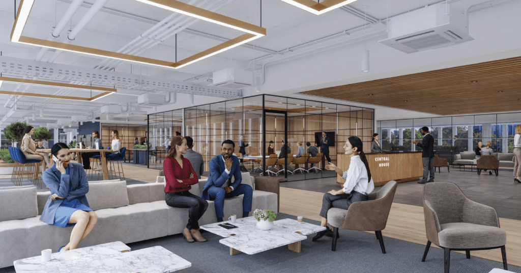
Rodd: As we’ve already discussed, it’s going to be versatile space with a lot of flexibility for subdivision with easy and almost endless configurations. We have done quite a few test fit-outs through our Interiors team here at Architectus. Like all the buildings within Macquarie Square it’s going to filled with the highest levels of ‘smart building’ connectivity. Central House tenants will enjoy all manner of technology and services that monitor the building constantly with electronic sensors and actuators to make it the most comfortable experience possible, and also the most energy efficient experience. Our Interiors division have spent a lot of time thinking about the post-Covid workplace right now, but also what's it going to look like as the nature of work continues to change over time. Tenancies will be all about spaces for collaboration and places to casually interact, rather than having banks of fixed workstations. As we all know, people don't necessarily sit at the same desk any more – especially when they can carry their entire work life around with them on a laptop! It’s really important to ask, why do people go into the office? It's to collaborate, to do some brainstorming and to sit around the table, face to face. The workspace experience at Central House will facilitate that. It certainly isn’t a data entry centre. It’s a place for connection and collaboration in all its forms.

You talked earlier about the interaction with sun and shade on the ground plane. How would you describe the access to natural light on the commercial floors of Central House?
Rodd: The building is fantastically positioned for sunlight. The commercial floor plates are only about 25 metres across, so there’s very little deep space that’s far away from a window. We’ve analysed that closely with contour mapping and there are only a few areas that won’t have direct access to natural light, and they’re directly in front of the lifts which is an ideal place for meeting rooms. The rest of the floors will be flooded with light. It’s actually meant that our design response has needed to include quite significant and innovative sun shading that – whilst not blocking the views – allows tenants to easily control the thermal load for comfort and also optimise energy efficiency.
How would you describe the façade? What are people going to see as they walk towards Central House?
Rodd: They’re going to see a very slick, modern metallic façade with vertical sun shading fins, as well as horizontal awning elements that create interesting patterns. There’s a strong visual contrast between the podium and the tower that rises above it. We've put a lot of thought into where to emphasise the horizontal elements in the façade and where it’s best to emphasise the vertical elements. The fins on the tower, in particular, are closely-spaced and create a very bold and striking look. They’re bronze in colour, that creates a distinct aesthetic within Macquarie Square. It’s quite a contrast to the façade of the Glasshouse which is defined more by its large white frame.
Central House has been designed to deliver a 5-star Green Star rating. Can you talk us through some of the sustainability features?
Rodd: Again, it’s all about getting the fundamentals right. First and foremost, that’s about sun control. It has driven so much of the design aesthetic for Central House. Within the building’s controllable elements, we’ve used very efficient mechanical systems. Beyond that, Macquarie Square is a brilliant location for sustainability with excellent access to both public and active transport options and, as you’d expect, there will be excellent end-of-trip facilities with secure bike storage. There will also be solar panels, high-performance shading, double-skinned glass, a green roof with mature trees, and fully integrated landscaping that essentially blends the building seamlessly into the park. There will no doubt be other opportunities to improve efficiency and environmental performance even further too.
Just finally, Architectus has created many mixed-use commercial developments. What stands out about this one?
Rodd: As an architect, I found the Central House project to be a rewarding intellectual challenge despite its complexity due to the site constraints. The public connections are going to be very good. It has a pedestrian easement that basically forms the front of the building that connects the whole precinct. It interfaces seamlessly with the park, with all the food and beverage options almost spilling on to it. There’s a grand stairway, a lift for accessibility, so it’s providing an incredibly high level of amenity. It has been challenging to find ways to deliver all these features, but our ongoing dialogue with John Holland has been excellent, and they have been receptive to our ideas. The working relationship has been fantastic, and we are eager to see Central House completed and tenanted.
Tenancy enquires for Central House are open now through Macquarie Square leasing agents, Rob Gishen & Marcus Pratley. Get in touch today