Recently, we caught up with Dan Szwaj, Director at Turner – acclaimed Sydney architecture, urban design, interiors and experiential design studio. Dan discusses the evolution of John Holland’s ambitious Macquarie Square masterplan, and explores some of the finer details behind the next stage to be delivered in the landmark precinct, ‘The Stockmarket’.

Dan, what role has Turner played at Macquarie Square?
Dan: John Holland first brought us on board to refine the broad masterplan that had already been created for Macquarie Square. Our work involved a lot of detailed design thinking, which really started to inform the shape of the precinct as it is today, right down to the language and naming of the individual buildings. Whilst it was always clear the masterplan would have a commercial workplace focus, we invested a lot of time and energy into understanding the site context and exploring what makes it so unique. We wanted to create a precinct of the future, centred around Catherine Hamlin Park. Why would someone want to work here? Who would want to come here? What makes it different to other locations? Answering these fundamental questions was a really important part of the process.
What were some of the things that stood out most when you first became involved?
Dan: The thing that really stood out was the project’s proximity to the new Sydney Metro rail line, which will open in 2024. It’s very close, directly across Waterloo Road. Its location, together with the notion of a ‘30-minute city’, was definitely a big catalyst for us. Access is a major consideration for any modern workplace. Can you get people there easily? At the moment, the journey (to Macquarie Park) is still a bit convoluted. But I think in another year or so, we’re going to see big changes in terms of how the Sydney Metro reframes these journeys and makes everything so much more accessible, with services every 4 minutes in peak periods. That’s been really interesting, quite fundamental, and it certainly guided a lot of our thinking.
Macquarie Square is a major precinct, centred around a significant (7,000sqm) public green space, Catherine Hamlin Park. How did you go about detailing such an expansive masterplan, with so many different elements?
Dan: Everything started with the public realm and Catherine Hamlin Park, because even before Macquarie Square is a workplace, it’s this sweeping public domain. That street-level environment is what we all interact with first, so we were determined to make it a very ‘people friendly’ experience. The journey to work should be enjoyable, lunchtime should be a time to relax or connect with colleagues and the time after work should offer a space to unwind.
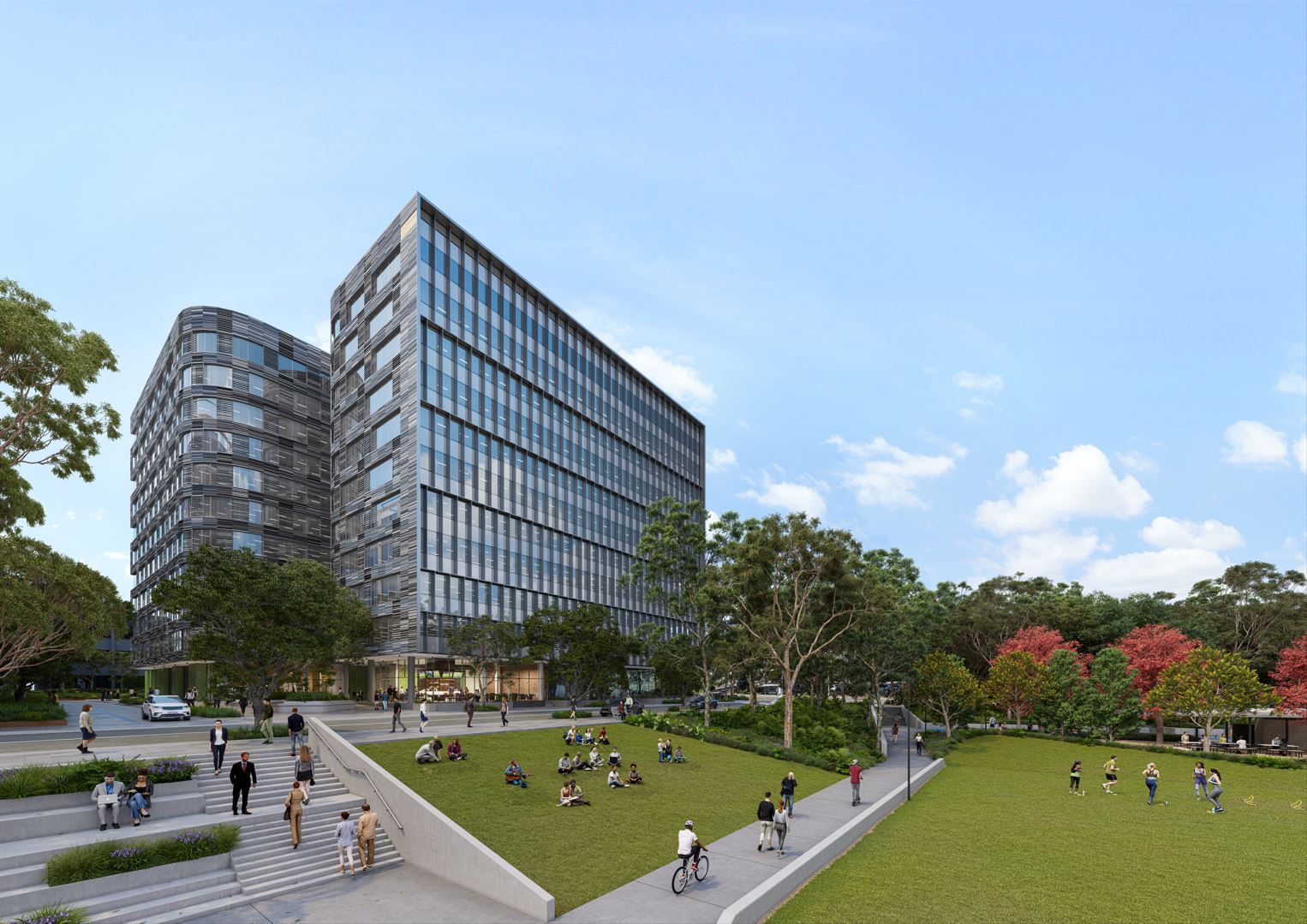
Whilst (landscape architects) McGregor Coxall are delivering the park itself, we’ve certainly spent a lot of time thinking about that space. The ground plane within the masterplan has been carefully curated so that each of the different buildings has a direct relationship to the public realm, to ensure the park is always a real focal point. If you look at The Stockmarket as an example, there’s real diversity of food and beverage offerings at street level. It’s north-west facing so it will get fantastic views across the park with a lot of sunshine, especially in winter. That’s coupled with other day-to-day services and activities that relate to health and wellbeing. It will create a real sense of street life with a wonderful diversity around the precinct from the moment you arrive, to the moment you head home.
We’ve also kept in mind that not everyone wants to go to a café or a restaurant at lunchtime. Just having the ability to get outside and sit under a tree, feel the grass between your toes, connect with nature, and enjoy the park experience is so important. Ultimately, our role within the public realm design is to make sure the park gets enough sunshine, is easily accessible and that each of the buildings has a meaningful connection to it. I really think we’ve achieved that.
Looking at the Glasshouse already delivered by John Holland at Macquarie Square – and those buildings still to come – the masterplan features a wonderful variety of spaces and buildings. What was your thinking there?
Dan: That is very intentional. We looked closely at the built form and wanted to have a real diversity of building scales, heights and footprints to reflect the diversity you’d naturally experience in urban environments. We certainly didn’t want all five buildings to look and feel exactly the same. Who wants to work in a ubiquitous plain box? Each building within the precinct has its own character and materiality. In designing a masterplan like this, you really need to think about the scale of the individual buildings, the position they hold within the precinct, and the relationship they have with each other, as well as the park and the public spaces that connect them. Looking back now, I think this was one of the key things we added to the project – diversifying the Macquarie Park skyline.
What about access to, and within, Macquarie Square?
Dan: A lot of thought and refinement has gone into the way people get to and from the precinct, as well as Catherine Hamlin Park. We wanted the entire masterplan to be highly permeable, allowing tenants and visitors to access it and walk through in many different ways. There’s a network of streets and pedestrian laneways and we’ve looked closely at the scale and relationship of those to create a variety of street-level experiences, whilst ensuring clear delineation between car and pedestrian movements. Building separation was also a key design consideration. We carefully located each building within its envelope whilst including ample separation to avoid the sense of overcrowding. The result is a street-level diversity that you’d normally only experience in a bustling city or urban area.
What type of entry experience can future tenants expect at The Stockmarket?
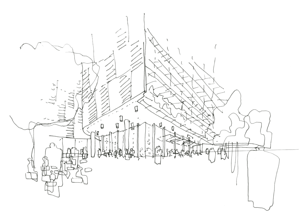
Dan: The Stockmarket effectively has three front doors – one from Waterloo Road, one that links directly to Catherine Hamlin Park and the various food and beverage offerings, and then a dedicated entry for cyclists and ‘bike foyer’ that leads to the end-of-trip facilities. I actually think the variety of arrival experiences is something that really sets The Stockmarket apart, rather than just having a single entry point like many commercial addresses.

How did Turner approach the concept of ‘sustainability’ when designing The Stockmarket?
Dan: Sustainability was a major consideration. The design embodies both passive and active environmental initiatives with Green Star 5 Star Design & As-Built and 5.5 Star NABERS Energy and 4 Star NABERS Water performance rating. That means these are embedded into the actual design of the building, we’re not just plugging things on at the end like you often see. We’ve considered fundamental things like the building footprint, access to natural light, and the configuration of the floorplates. We’ve also employed low reflective surfaces and performance glazing, deep set colonnades along the primary street frontages, and have integrated shade screening and external louvres on the façade. These are all included in the base design of The Stockmarket to really optimise long-term sustainability for tenants.
Another aspect we really wanted to encourage through the design of The Stockmarket is the modal shift towards active transport, especially in terms of cycling to work. A key component of the ground plane is a second front door, which is essentially a dedicated cycling foyer. You don’t have to ride through the car park. It’s an entrance just for cyclists at ground level, with a high level of amenity including change rooms, bike workshop and secure parking.
Once inside The Stockmarket, what can tenants expect from their workspaces?
Dan: A lot of thought has gone into the floorplates. The design is very flexible with a central services core and large spaces between columns providing generous clear spans and excellent view aspects. The separation of spaces helps to bring daylight right into the centre of the building and gives larger tenants the ability to connect multiple floors with internal spiral stairs.
This level of flexibility is important, because whilst The Stockmarket (and the wider Macquarie Square precinct) certainly has its own character and identity, there’s enough freedom to create different environments within. As architects, we want to deliver that perfect balance between a really strong architectural form, and giving future tenants the ability to shape their own workspaces in keeping with the needs of their team.
Turner has created many high-profile commercial addresses over the years.
What have you enjoyed most about working on Macquarie Square?
Dan: At Turner, we thrive on designing urban renewal projects for people to use and love, and this project is no different. I’ve really enjoyed shaping the overall masterplan with John Holland and taking the original vision to a whole new level. Our design creates a great experience for people at street-level, connects successfully with the surrounding precinct and delivers a fantastic workplace for tenants. It’s been a very satisfying process to be part of.
Tenancy enquires for The Stockmarket and Central House are open now through Macquarie Square leasing agents, Rob Gishen & Marcus Pratley. Get in touch today.